Level Design Breakdown · Unreal Engine 5 · Ongoing Horror Prototype
NewZozobra | Level Design Breakdown
NewZozobra is an ongoing personal Unreal Engine 5 horror prototype focused on atmosphere, exploration, environmental escalation and player tension.
This breakdown documents the level design thinking behind one compact playable space: layout, player flow, lighting, pickups, enemy pressure, hazards, backtracking and objective readability.
Project: NewZozobra
Status: Ongoing personal project, currently in active development
Role focus: Level Designer / Game Designer
Created by: Alejandro Casino
Portfolio: www.alsatiangames.es
Note: This article focuses on level design intention and current blockout implementation. The project is still in development, so the visuals are not final art. The goal is to show how the space is designed, how the player is guided, and how gameplay beats are structured.
1. Project Overview
The level is designed as a left-to-right progression space. The player starts on the left side, moves through a sequence of exploration and pressure areas, collects key pickups, reads danger through lighting and spatial composition, and progresses toward a final green objective on the right.
The main design intention is to create a horror level that feels tense but readable. The player should feel pressure, uncertainty and danger, but not confusion caused by poor visual communication.
For that reason, the blockout uses color-coded lighting, visible rewards, framed objectives and readable enemy pressure.
The level is not designed as a maze. The main path should remain understandable, while individual rooms create local uncertainty, risk and reward.
2. Level Design Goals
Clear left-to-right progression
The player starts on the left side of the level and is immediately oriented toward a visible final objective on the right.
From the beginning, the goal is readable because the final area is marked with green lighting, creating a clear visual destination even before the player fully understands the route.
Visible reward structure
The player can often see the reward before reaching it.
Pickups and the final exit are used as visual promises that encourage movement, curiosity and planning. The player is always given a reason to continue moving forward, even when the space becomes more threatening.
Lighting as atmosphere and player guidance
Lighting is used not only to create the horror atmosphere, but also to guide the player’s attention.
The level uses a deliberate color language:
- Green communicates reward, progression, health-related positive information and the final objective.
- Cyan / blue communicates calmness, guidance, windows, readable openings and points of interest.
- Red communicates danger, urgency, enemy pressure and survival.
- Darkness creates uncertainty, tension and horror atmosphere.
The goal is to keep the level dark and tense without making it visually confusing.
Risk-reward collectibles
Collectibles are placed both along safe routes and near danger beats.
This encourages exploration while allowing the player to make readable risk-reward decisions. When a collectible appears near red lighting or enemy pressure, the player understands that the reward is possible, but not free.
Checkpoint pacing
Checkpoints divide the level into readable progression chunks and reduce frustration after meaningful challenge beats.
Their placement supports the rhythm of the level: exploration, pressure, reward, recovery and progression.
Backtracking support
If the player misses a pickup, the level allows them to return and recover it instead of locking them out permanently.
This is important because all pickups are required to complete the level.
3. Blockout and Layout Sketch
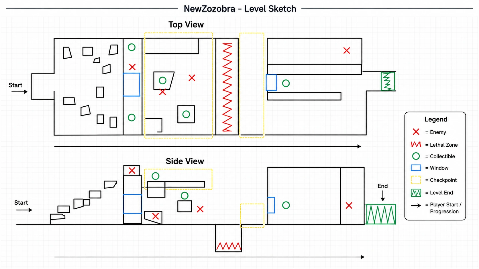
The initial sketch separates the level into two readings: a top-down layout for navigation and room structure, and a side-view layout for vertical flow, jumps, platforms, lethal zones and pickup placement.
The player begins on the left and progresses toward the final green exit zone on the right, but the level is structured internally into three clear gameplay areas.
Area 1 — Onboarding
The first area teaches basic jumping and spatial reading in a relatively controlled environment. An enemy is placed above the player, watching from a higher position, while two pickups are placed nearby.
Area 2 — Mechanical Pressure
The second area increases the mechanical challenge. Jumps become more demanding, platform spacing is less forgiving, and enemy pressure becomes stronger.
Area 3 — Route Interpretation
The third area teaches that not every path is necessarily safe, useful or correct. Some routes may be misleading, dangerous or incomplete.
Overall, the blockout is designed as a gradual progression: first teaching movement, then increasing execution difficulty, and finally challenging the player’s assumptions about navigation and correct paths.
Level Design Breakdown · Unreal Engine 5 · Ongoing Horror Prototype
NewZozobra | Level Design Breakdown
NewZozobra is an ongoing personal Unreal Engine 5 horror prototype focused on atmosphere, exploration, environmental escalation and player tension.
This breakdown documents the level design thinking behind one compact playable space: layout, player flow, lighting, pickups, enemy pressure, hazards, backtracking and objective readability.
Project: NewZozobra
Status: Ongoing personal project, currently in active development
Role focus: Level Designer / Game Designer
Created by: Alejandro Casino
Portfolio: www.alsatiangames.es
Note: This article focuses on level design intention and current blockout implementation. The project is still in development, so the visuals are not final art. The goal is to show how the space is designed, how the player is guided, and how gameplay beats are structured.
1. Project Overview
The level is designed as a left-to-right progression space. The player starts on the left side, moves through a sequence of exploration and pressure areas, collects key pickups, reads danger through lighting and spatial composition, and progresses toward a final green objective on the right.
The main design intention is to create a horror level that feels tense but readable. The player should feel pressure, uncertainty and danger, but not confusion caused by poor visual communication.
For that reason, the blockout uses color-coded lighting, visible rewards, framed objectives and readable enemy pressure.
The level is not designed as a maze. The main path should remain understandable, while individual rooms create local uncertainty, risk and reward.
2. Level Design Goals
Clear left-to-right progression
The player starts on the left side of the level and is immediately oriented toward a visible final objective on the right.
From the beginning, the goal is readable because the final area is marked with green lighting, creating a clear visual destination even before the player fully understands the route.
Visible reward structure
The player can often see the reward before reaching it.
Pickups and the final exit are used as visual promises that encourage movement, curiosity and planning. The player is always given a reason to continue moving forward, even when the space becomes more threatening.
Lighting as atmosphere and player guidance
Lighting is used not only to create the horror atmosphere, but also to guide the player’s attention.
The level uses a deliberate color language:
- Green communicates reward, progression, health-related positive information and the final objective.
- Cyan / blue communicates calmness, guidance, windows, readable openings and points of interest.
- Red communicates danger, urgency, enemy pressure and survival.
- Darkness creates uncertainty, tension and horror atmosphere.
The goal is to keep the level dark and tense without making it visually confusing.
Risk-reward collectibles
Collectibles are placed both along safe routes and near danger beats.
This encourages exploration while allowing the player to make readable risk-reward decisions. When a collectible appears near red lighting or enemy pressure, the player understands that the reward is possible, but not free.
Checkpoint pacing
Checkpoints divide the level into readable progression chunks and reduce frustration after meaningful challenge beats.
Their placement supports the rhythm of the level: exploration, pressure, reward, recovery and progression.
Backtracking support
If the player misses a pickup, the level allows them to return and recover it instead of locking them out permanently.
This is important because all pickups are required to complete the level.
3. Blockout and Layout Sketch
The initial sketch separates the level into two readings: a top-down layout for navigation and room structure, and a side-view layout for vertical flow, jumps, platforms, lethal zones and pickup placement.
The player begins on the left and progresses toward the final green exit zone on the right, but the level is structured internally into three clear gameplay areas.
Area 1 — Onboarding
The first area teaches basic jumping and spatial reading in a relatively controlled environment. An enemy is placed above the player, watching from a higher position, while two pickups are placed nearby.
Area 2 — Mechanical Pressure
The second area increases the mechanical challenge. Jumps become more demanding, platform spacing is less forgiving, and enemy pressure becomes stronger.
Area 3 — Route Interpretation
The third area teaches that not every path is necessarily safe, useful or correct. Some routes may be misleading, dangerous or incomplete.
Overall, the blockout is designed as a gradual progression: first teaching movement, then increasing execution difficulty, and finally challenging the player’s assumptions about navigation and correct paths.
4. Current Unreal Engine Blockout
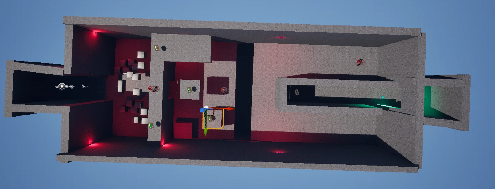
The Unreal Engine implementation follows the sketch: a compact left-to-right level with multiple rooms, elevation changes, collectibles, enemies, checkpoints and a final exit.
At this stage, simple materials, blockout geometry and color-coded lighting are used to validate the design before investing in final art.
The player always has a sense that there is something valuable ahead. The reward is visible before it is fully reachable, which creates motivation and gives the player a reason to move through danger instead of wandering without purpose.
Current Implementation Notes
- The left side starts wider and busier, creating a first exploration space where the player can read pickups, obstacles and enemy presence.
- The central section increases pressure by combining narrower movement, enemies, stronger red lighting and a lethal gap / death zone.
- The right side becomes more directed and goal-oriented, using a clearer corridor and green final lighting to communicate completion.
- The current blockout intentionally prioritizes player flow, readability and pacing over final art quality.
4. Current Unreal Engine Blockout
The Unreal Engine implementation follows the sketch: a compact left-to-right level with multiple rooms, elevation changes, collectibles, enemies, checkpoints and a final exit.
At this stage, simple materials, blockout geometry and color-coded lighting are used to validate the design before investing in final art.
The player always has a sense that there is something valuable ahead. The reward is visible before it is fully reachable, which creates motivation and gives the player a reason to move through danger instead of wandering without purpose.
Current Implementation Notes
- The left side starts wider and busier, creating a first exploration space where the player can read pickups, obstacles and enemy presence.
- The central section increases pressure by combining narrower movement, enemies, stronger red lighting and a lethal gap / death zone.
- The right side becomes more directed and goal-oriented, using a clearer corridor and green final lighting to communicate completion.
- The current blockout intentionally prioritizes player flow, readability and pacing over final art quality.
5. Intended Player Flow
1. Entry and first read
The player enters from the left and gets time to understand scale, movement space and the general direction of progression.
The final direction is suggested early through the level composition and the visible green objective on the right.
2. Early jumping and reward
The first area teaches basic movement and jumping while showing pickups as readable rewards.
The player learns that green-highlighted objects are worth moving toward.
3. First enemy pressure
Enemies are introduced around transitions and elevated areas, forcing the player to read the room before advancing.
Enemy placement is not random. It is used to create movement decisions and pressure around important spaces.
4. Checkpoint and escalation
Checkpoints secure progress after meaningful challenge beats, allowing the level to increase pressure without becoming too punishing.
5. Central lethal beat
The red hazard / death zone creates a memorable pacing break and asks for more deliberate movement.
This area changes the rhythm of the level and forces the player to read space more carefully.
6. Final approach
The player reaches the final door, but the level cannot be completed until all pickups have been collected.
The door becomes a confirmation point: reaching it is not enough if the player has ignored or missed part of the level’s collectible structure.
7. Backtracking realization
The final pickup does not follow the player’s natural forward path.
When the player reaches the door and realizes it will not open, they understand that something is missing. The missing pickup is behind them, forcing the player to return, re-read the space and understand that progression is not always purely forward.
This creates a controlled backtracking moment. The player is not punished permanently for missing the pickup, because the level allows them to return and recover it.
6. Player Guidance Through Environment
The level guides the player through environmental composition rather than relying only on UI.
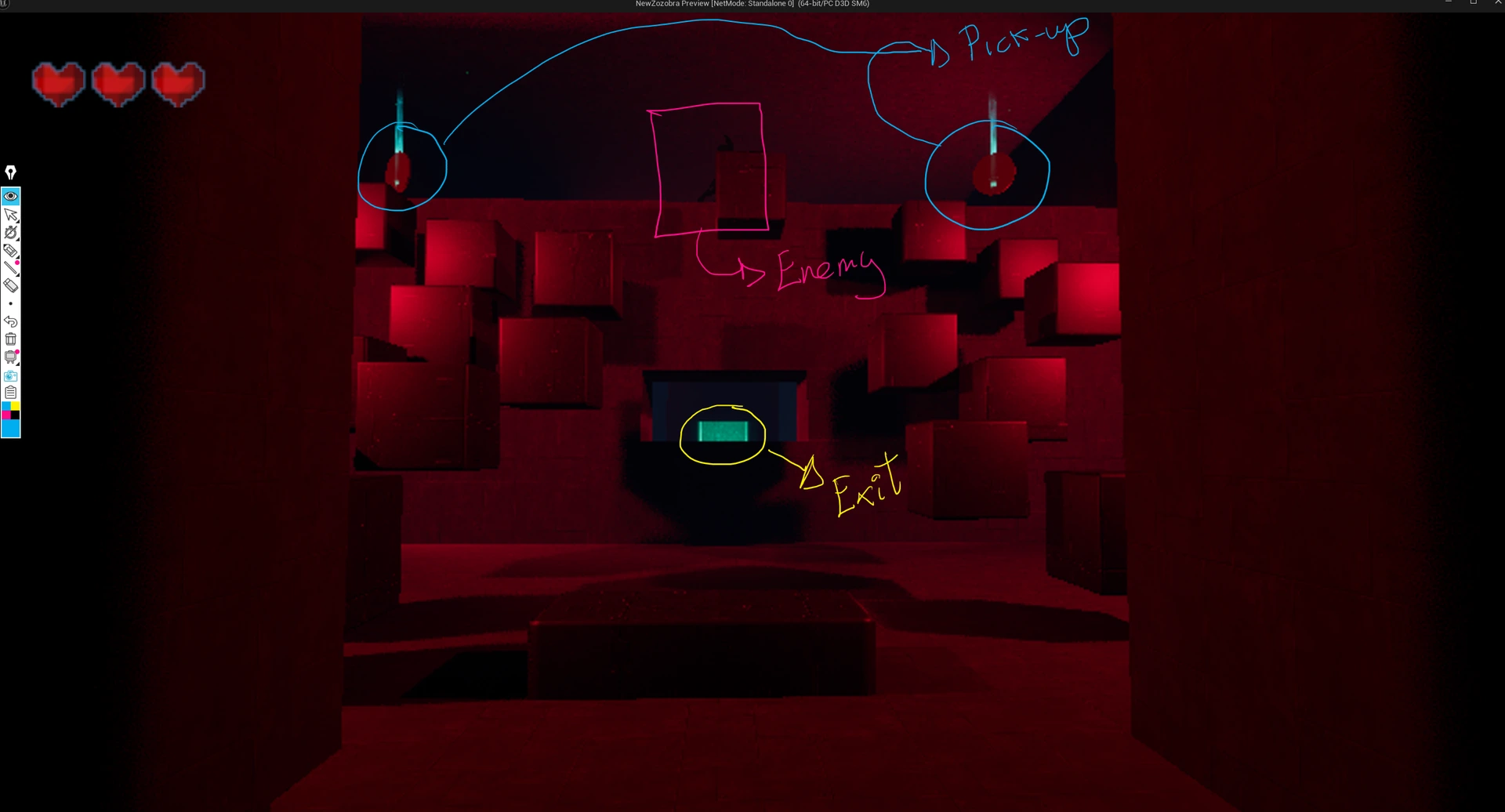
The final objective is visually framed, pickups glow as desirable objects, and enemies are placed where they can be understood as pressure points before the player moves into their zones.
The player is often shown the reward before reaching it. This creates anticipation and helps the player understand why they should move toward a certain space.
The exit is visible through a window-like opening, while pickups and enemy positions create a triangle of attention in the room. The goal is to let the player notice both reward and threat before fully committing to movement.
5. Intended Player Flow
1. Entry and first read
The player enters from the left and gets time to understand scale, movement space and the general direction of progression.
The final direction is suggested early through the level composition and the visible green objective on the right.
2. Early jumping and reward
The first area teaches basic movement and jumping while showing pickups as readable rewards.
The player learns that green-highlighted objects are worth moving toward.
3. First enemy pressure
Enemies are introduced around transitions and elevated areas, forcing the player to read the room before advancing.
Enemy placement is not random. It is used to create movement decisions and pressure around important spaces.
4. Checkpoint and escalation
Checkpoints secure progress after meaningful challenge beats, allowing the level to increase pressure without becoming too punishing.
5. Central lethal beat
The red hazard / death zone creates a memorable pacing break and asks for more deliberate movement.
This area changes the rhythm of the level and forces the player to read space more carefully.
6. Final approach
The player reaches the final door, but the level cannot be completed until all pickups have been collected.
The door becomes a confirmation point: reaching it is not enough if the player has ignored or missed part of the level’s collectible structure.
7. Backtracking realization
The final pickup does not follow the player’s natural forward path.
When the player reaches the door and realizes it will not open, they understand that something is missing. The missing pickup is behind them, forcing the player to return, re-read the space and understand that progression is not always purely forward.
This creates a controlled backtracking moment. The player is not punished permanently for missing the pickup, because the level allows them to return and recover it.
6. Player Guidance Through Environment
The level guides the player through environmental composition rather than relying only on UI.
The final objective is visually framed, pickups glow as desirable objects, and enemies are placed where they can be understood as pressure points before the player moves into their zones.
The player is often shown the reward before reaching it. This creates anticipation and helps the player understand why they should move toward a certain space.
The exit is visible through a window-like opening, while pickups and enemy positions create a triangle of attention in the room. The goal is to let the player notice both reward and threat before fully committing to movement.
7. Encounter and Hazard Structure
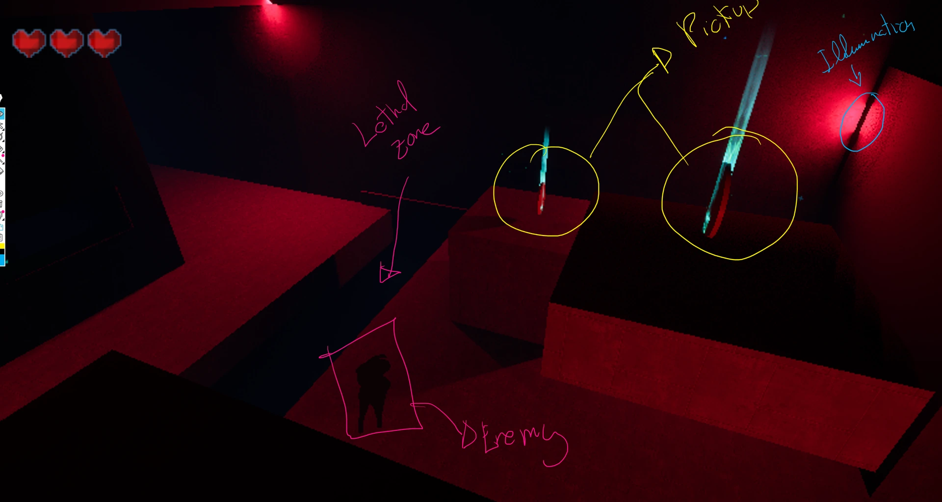
Enemy placement is used as a pacing tool rather than constant combat.
Enemies appear at key transition points: near platforms, near pickups, near route decisions, and near areas where the player must commit to movement.
This creates pressure without making the level feel randomly crowded.
Enemy Zone Logic
Each enemy is designed around a zone of control.
Enemies only chase the player while the player is inside their area, but once activated they do not stop until the player escapes that zone or is defeated.
This makes enemy pressure spatially readable. The player learns that certain rooms or platforms are dangerous territories, not just places with random enemies.
Enemy Design Intention
- Enemies are placed where they can influence movement decisions, not just occupy empty space.
- Their placement creates pressure around collectibles and transitions.
- Enemies encourage the player to choose between safety and reward.
- The current enemy behavior is intentionally simple while the level layout and pacing are still being evaluated.
- The goal is not constant combat, but controlled pressure.
Hazard Design
The lethal zone is placed in the middle section to create a strong rhythm change.
Earlier rooms allow exploration, but this section asks the player to read space more carefully. The red lighting supports the danger language and makes the lethal area feel connected to the overall horror mood.
The lethal zone acts as a clear contrast point: before it, the player has more room to explore; around it, movement becomes more deliberate and survival-focused.
7. Encounter and Hazard Structure
Enemy placement is used as a pacing tool rather than constant combat.
Enemies appear at key transition points: near platforms, near pickups, near route decisions, and near areas where the player must commit to movement.
This creates pressure without making the level feel randomly crowded.
Enemy Zone Logic
Each enemy is designed around a zone of control.
Enemies only chase the player while the player is inside their area, but once activated they do not stop until the player escapes that zone or is defeated.
This makes enemy pressure spatially readable. The player learns that certain rooms or platforms are dangerous territories, not just places with random enemies.
Enemy Design Intention
- Enemies are placed where they can influence movement decisions, not just occupy empty space.
- Their placement creates pressure around collectibles and transitions.
- Enemies encourage the player to choose between safety and reward.
- The current enemy behavior is intentionally simple while the level layout and pacing are still being evaluated.
- The goal is not constant combat, but controlled pressure.
Hazard Design
The lethal zone is placed in the middle section to create a strong rhythm change.
Earlier rooms allow exploration, but this section asks the player to read space more carefully. The red lighting supports the danger language and makes the lethal area feel connected to the overall horror mood.
The lethal zone acts as a clear contrast point: before it, the player has more room to explore; around it, movement becomes more deliberate and survival-focused.
8. Pickups, Final Door and Backtracking Logic
The level is built around a simple completion rule: the final door only opens when every pickup has been collected.
This gives collectibles a mechanical purpose beyond score or decoration. They become keys to progression, not optional visual noise.
Most pickups are placed along or near the player’s expected route, so the player learns that collecting them is part of progression.
However, the final pickup is deliberately placed away from the natural forward path. When the player reaches the final door and it does not open, they understand that something is missing.
This creates a controlled backtracking moment.
The player must return, re-read the space and identify the missing pickup behind them. Because the level supports returning through previous areas, missing a pickup is not a fail state. It becomes a reason to reinterpret the level and understand that not all progress is purely forward movement.
Design Purpose
- It makes collectibles meaningful.
- It encourages the player to observe the environment.
- It rewards spatial memory.
- It creates a reason to revisit previous spaces.
- It reinforces that some routes may look correct but are incomplete.
- It allows the player to correct mistakes without restarting the level.
8. Pickups, Final Door and Backtracking Logic
The level is built around a simple completion rule: the final door only opens when every pickup has been collected.
This gives collectibles a mechanical purpose beyond score or decoration. They become keys to progression, not optional visual noise.
Most pickups are placed along or near the player’s expected route, so the player learns that collecting them is part of progression.
However, the final pickup is deliberately placed away from the natural forward path. When the player reaches the final door and it does not open, they understand that something is missing.
This creates a controlled backtracking moment.
The player must return, re-read the space and identify the missing pickup behind them. Because the level supports returning through previous areas, missing a pickup is not a fail state. It becomes a reason to reinterpret the level and understand that not all progress is purely forward movement.
Design Purpose
- It makes collectibles meaningful.
- It encourages the player to observe the environment.
- It rewards spatial memory.
- It creates a reason to revisit previous spaces.
- It reinforces that some routes may look correct but are incomplete.
- It allows the player to correct mistakes without restarting the level.
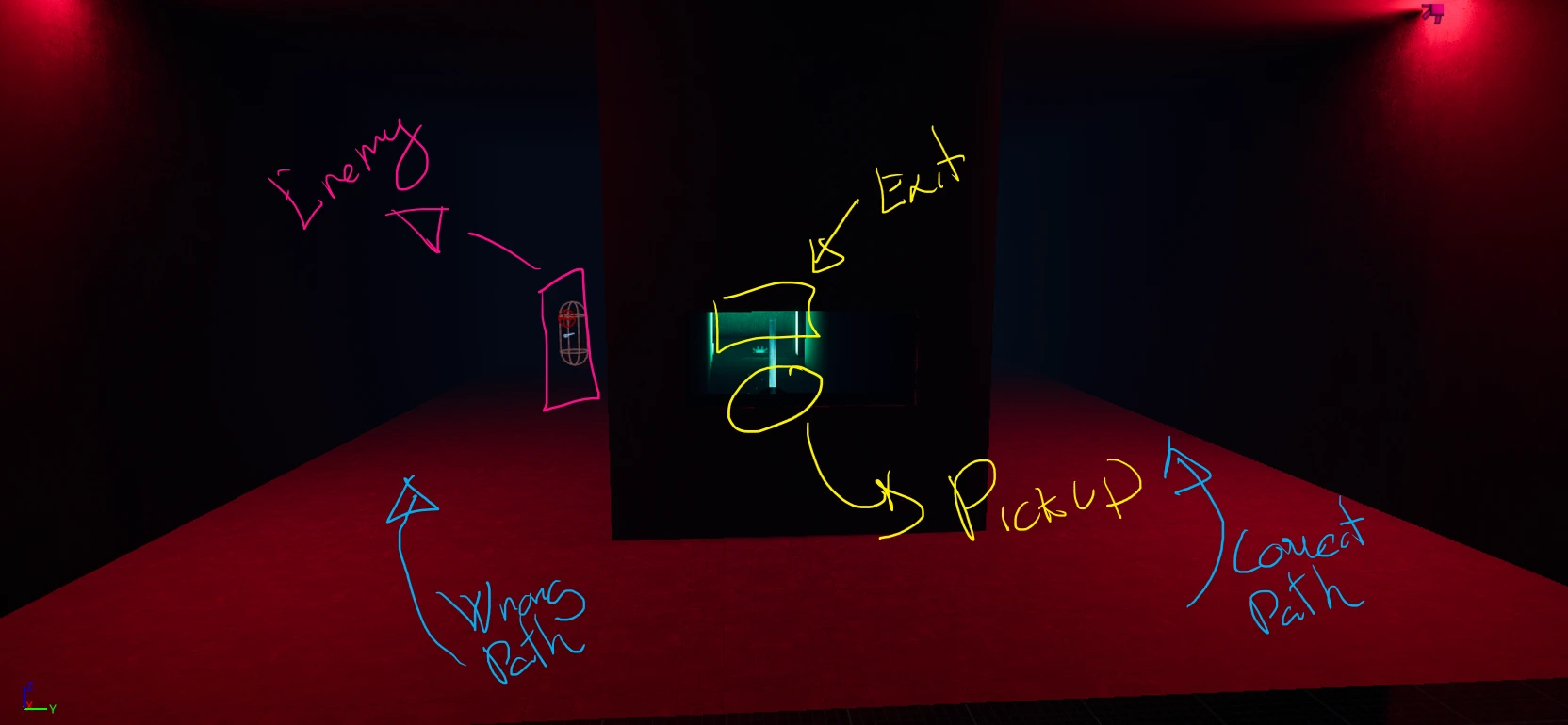
9. Lighting, Pickups and Objective Readability
The lighting language is deliberately simple and readable.
Red communicates threat, urgency and survival. Cyan/blue highlights windows, calm guidance and readable points of interest. Green marks pickups, health-related positive information and the final objective.
This color language is especially important because the level is dark and becomes more enclosed with the ceiling. The goal is not to remove darkness, but to make darkness functional.
The player should feel tension while still understanding where danger is, where rewards are, where possible routes are, and where the final objective is.
In this sense, lighting supports both atmosphere and usability. It creates the horror mood while also functioning as a level design tool.
Color Language Summary
- Green: reward, pickups, health, progression, final objective.
- Cyan / blue: guidance, calmness, windows, visibility, readable points of interest.
- Red: enemy pressure, danger, lethal zones, urgency, survival.
- Darkness: uncertainty, tension, horror atmosphere.
10. Iteration and Current Questions
The project is still in active development, so the current iteration is based on self-testing, camera reads and level design review.
The next step is to test the space with other players and compare intended flow against actual player behavior.
Current Questions
- Does the player understand the main left-to-right progression without explicit instructions?
- Does the player notice that the final objective is visible from the beginning?
- Are pickups readable enough in dark spaces without feeling artificially highlighted?
- Does the player understand that all pickups are required to open the final door?
- Is the final missing pickup backtracking moment clear, fair and satisfying?
- Do enemies create pressure and movement decisions without feeling random?
- Are enemy zones readable enough for the player to understand when they are in danger?
- Does the central lethal zone feel like a fair challenge or an unexpected punishment?
- Does the final green exit read clearly from the player camera?
- Can the player return for missed pickups without feeling trapped or unfairly punished?
Planned Improvements
- Record a short player test and compare intended flow against actual player behavior.
- Refine enemy zones after testing whether players understand when they are being pursued.
- Adjust pickup placement if players miss the final collectible for the wrong reason.
- Improve map annotations with numbered gameplay beats.
- Adjust lighting intensity after the ceiling is finalized, keeping the level dark but readable.
- Replace temporary blockout props only after the level flow is validated.
11. What This Project Demonstrates
- I can translate a 2D level sketch into a playable Unreal Engine blockout.
- I think about level design through flow, readability, pacing, risk-reward and player guidance.
- I use lighting and color as functional design tools, not only as visual decoration.
- I design collectibles as progression tools, not only as rewards.
- I understand how enemy zones, pursuit pressure and backtracking can shape player behavior.
- I understand that a level is not finished when it is built; it needs iteration through testing and observation.
- My technical background helps me prototype quickly and communicate implementation constraints clearly.
Closing Statement
NewZozobra is still unfinished, but it is already a useful practical space for showing how I approach level design.
The most important lesson from this prototype so far is that atmosphere and readability need to work together. A horror level can be mysterious, but the player should be tense for the right reasons, not confused for the wrong ones.
This level uses visible rewards, color-coded lighting, enemy pressure, collectible requirements and controlled backtracking to create a compact horror progression space where the player is constantly encouraged to read, interpret and re-evaluate the environment.
About Alsatian Games
Alsatian Games is an independent game design and playtesting project focused on player experience, game design reviews, mechanics analysis and indie game playtesting.
9. Lighting, Pickups and Objective Readability
The lighting language is deliberately simple and readable.
Red communicates threat, urgency and survival. Cyan/blue highlights windows, calm guidance and readable points of interest. Green marks pickups, health-related positive information and the final objective.
This color language is especially important because the level is dark and becomes more enclosed with the ceiling. The goal is not to remove darkness, but to make darkness functional.
The player should feel tension while still understanding where danger is, where rewards are, where possible routes are, and where the final objective is.
In this sense, lighting supports both atmosphere and usability. It creates the horror mood while also functioning as a level design tool.
Color Language Summary
- Green: reward, pickups, health, progression, final objective.
- Cyan / blue: guidance, calmness, windows, visibility, readable points of interest.
- Red: enemy pressure, danger, lethal zones, urgency, survival.
- Darkness: uncertainty, tension, horror atmosphere.
10. Iteration and Current Questions
The project is still in active development, so the current iteration is based on self-testing, camera reads and level design review.
The next step is to test the space with other players and compare intended flow against actual player behavior.
Current Questions
- Does the player understand the main left-to-right progression without explicit instructions?
- Does the player notice that the final objective is visible from the beginning?
- Are pickups readable enough in dark spaces without feeling artificially highlighted?
- Does the player understand that all pickups are required to open the final door?
- Is the final missing pickup backtracking moment clear, fair and satisfying?
- Do enemies create pressure and movement decisions without feeling random?
- Are enemy zones readable enough for the player to understand when they are in danger?
- Does the central lethal zone feel like a fair challenge or an unexpected punishment?
- Does the final green exit read clearly from the player camera?
- Can the player return for missed pickups without feeling trapped or unfairly punished?
Planned Improvements
- Record a short player test and compare intended flow against actual player behavior.
- Refine enemy zones after testing whether players understand when they are being pursued.
- Adjust pickup placement if players miss the final collectible for the wrong reason.
- Improve map annotations with numbered gameplay beats.
- Adjust lighting intensity after the ceiling is finalized, keeping the level dark but readable.
- Replace temporary blockout props only after the level flow is validated.
11. What This Project Demonstrates
- I can translate a 2D level sketch into a playable Unreal Engine blockout.
- I think about level design through flow, readability, pacing, risk-reward and player guidance.
- I use lighting and color as functional design tools, not only as visual decoration.
- I design collectibles as progression tools, not only as rewards.
- I understand how enemy zones, pursuit pressure and backtracking can shape player behavior.
- I understand that a level is not finished when it is built; it needs iteration through testing and observation.
- My technical background helps me prototype quickly and communicate implementation constraints clearly.
Closing Statement
NewZozobra is still unfinished, but it is already a useful practical space for showing how I approach level design.
The most important lesson from this prototype so far is that atmosphere and readability need to work together. A horror level can be mysterious, but the player should be tense for the right reasons, not confused for the wrong ones.
This level uses visible rewards, color-coded lighting, enemy pressure, collectible requirements and controlled backtracking to create a compact horror progression space where the player is constantly encouraged to read, interpret and re-evaluate the environment.
About Alsatian Games
Alsatian Games is an independent game design and playtesting project focused on player experience, game design reviews, mechanics analysis and indie game playtesting.